BBVA’S Digital Workplace
bACKGROUND
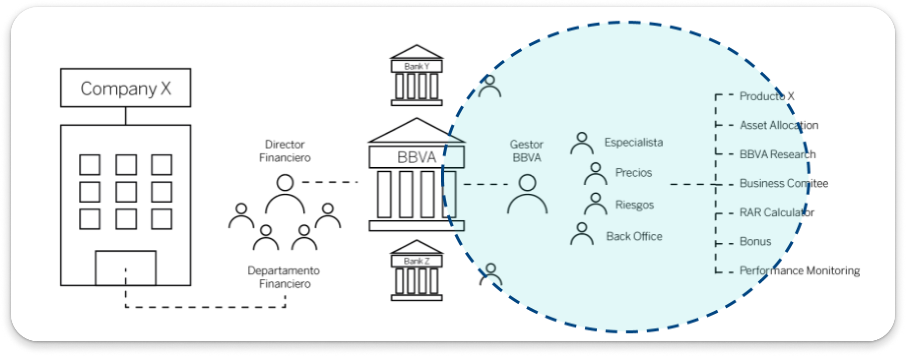
The Digital Workplace (DWP) project aimed to unify 23 different bank systems into a single platform for commercial bankers across the U.S., leveraging a Salesforce-based solution. Initially a global initiative by BBVA, I was invited to adapt the tool for the U.S. market in collaboration with designers from Spain, despite the transition to remote onboarding due to COVID-19 restrictions. This setup required a flexible approach to bridge knowledge gaps and cultural nuances between the Spain and U.S. banking systems.
This is the DWP homepage. This screen is the first thing bankers will see when they log in.
“Designed by bankers, with bankers: to help them achieve their day-to-day activities and help their clients make business easier.”
Outdated banking systems: shown are two examples of outdated systems that DWP seeks to bring together and replace.
problem
Prior to DWP, bankers relied on multiple isolated systems, each with its own data formats and protocols. This fragmentation created lengthy workflows, increased errors, and hindered real-time data visibility—ultimately affecting decision-making and customer service. Bankers often spent too much time navigating systems instead of focusing on client interactions and strategic tasks.
challenges
Remote collaboration with global teams: With onboarding shifted online, it was crucial to develop efficient ways to communicate complex workflows with our overseas colleagues.
Adapting to US banking contexts: Tailoring the Spanish version of DWP to meet U.S. regulatory and functional requirements involved learning about specific industry needs.
Language & terminology barriers: Bilingual sessions and industry jargon required additional steps for clarity, using Miro boards extensively for collaborative feedback.
Understanding commercial banking in two languages
Before COVID-19, I was set to shadow designers in Spain, but remote work required quick adaptation. I onboarded through bilingual Miro sessions, which helped bridge the original system in Spain with the needs of U.S. bankers. Although fluent in Spanish, adapting to Spain-specific banking terminology was an unexpected challenge. Engaging in these sessions, I contributed actively by asking questions and adding notes, absorbing key insights for the U.S. adaptation.
Miro collaboration board used to compare & contrast the differences between the Renewals tool in Spain and how it would translate within the US banking context.
Opportunities Flow Miro board: Shared board with the Spain design team in which they detailed the Opportunities flow. I would ask questions and inevitably add sticky notes as needed.
building on existing research
Since this project had an established foundation in the U.S., I inherited a substantial body of research and documentation. Much of it was in Spanish—a test of my fluency, especially with Spain-specific business terms. I spent considerable time studying commercial banking workflows and Salesforce documentation, familiarizing myself with the complex landscape.
Much of my time was spent studying documentation and research related to commercial banking, Digital Workplace documentation, Salesforce, etc.
Some (most) of the documentation was in Spanish. I’m fluent but not in Spain Spanish & business Spanish! This was a curveball for me that was interesting to navigate.
design approach
Focused user research and training 🗣️ We co-created training materials and conducted usability testing with U.S.-based bankers, identifying feature priorities and pain points specific to the U.S. context.
Stakeholder engagement & iterative feedback 🔄 Regular syncs with stakeholders helped strategize design choices, track progress, and ensure alignment with project goals.
Bilingual and visual collaboration across the world 🌍 Miro boards provided a real-time platform for documenting questions and feedback, highlighting areas for localization in the U.S. version.
other Deliverables
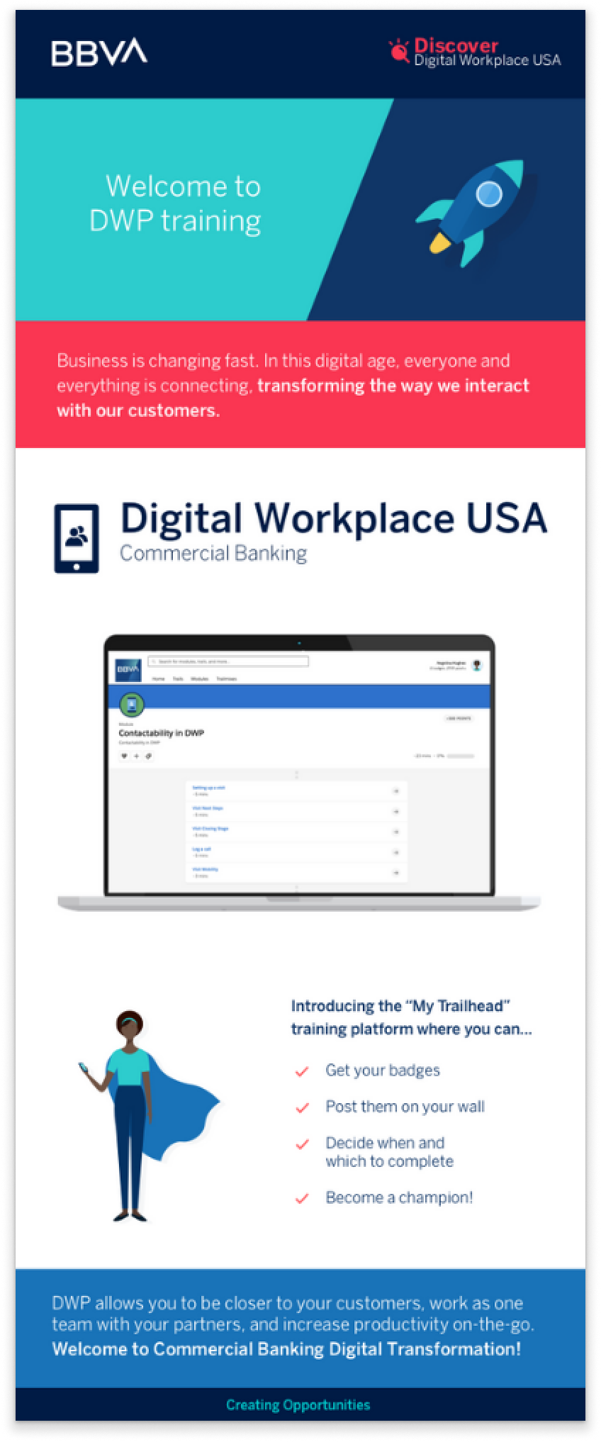
I translated and developed comprehensive onboarding materials—step-by-step guides, video tutorials, and interactive modules tailored for DWP—to ensure bankers could confidently navigate the new platform. I also dusted off my graphic design skills and designed several marketing communications with the bankers as our audience. These were meant to communicate and explain the different aspects of DWP and get bankers excited about what was to come.
My main research work happened to be around Reports and Dashboards, one of the many tools built into DWP that allows the banker to analyze sets of dashboards in regards to their daily negotiations.
Reports and Dashboards
Our efforts were focused on two separate views for dashboards: one for managers and one for non-managerial level bankers depending on the information they need to see within their dashboard.
My goal at this point was to understand the banker’s point of view regarding what they would like to see within their reports & dashboards. Design and implement dashboards for decision-making.
Co-Creation Workshop sessions
I co-facilitated remote workshops with bankers across the U.S., aiming to gather actionable insights for DWP’s dashboards. We worked closely with our “champions,” internal leaders who were integral to the tool’s rollout. Alongside my colleagues, PM Megan and Spain-based designer Ola, I ran interactive exercises, introducing tools like Miro and Invision to participants, some of whom were new to these platforms. This collaborative format fostered genuine engagement, giving stakeholders a voice in shaping DWP’s features.
Miro board showing the three levels of Reports & Dashboards: Homepage, Dashboards and Reports
Salesforce report: showing the underlying report that bankers can access with specific client details


Designing alongside non-designers
To kick off the workshop sessions, Ola and I gave a short presentation detailing our role as designers, what to expect over the next couple of days and essentially set the context of the sessions. Additionally, we introduced the tools and exercises we would be using. Our champions had never really used Miro or Invision! Finally, we asked for their patient participation.
These were sessions to gather ideas for now, and nothing in these meetings was to be a final decision. We asked they be flexible and courteous and to speak up when they had any thoughts or ideas. Ola and I explained that our purpose in the sessions is to gather as much information related to their needs, wants, and priorities.
Techniques
Our workshop sessions employed the diverge-and-converge technique to independently brainstorm ideas, followed by group discussions. Our main exercises included:
Tree Map Exercise in Miro: Grouping and organizing data points.
Voting Exercise in Excel: Enabling participants to prioritize elements independently.
Prioritization Exercise in Miro: Visualizing and arranging data based on user preferences.
Accessibility findings
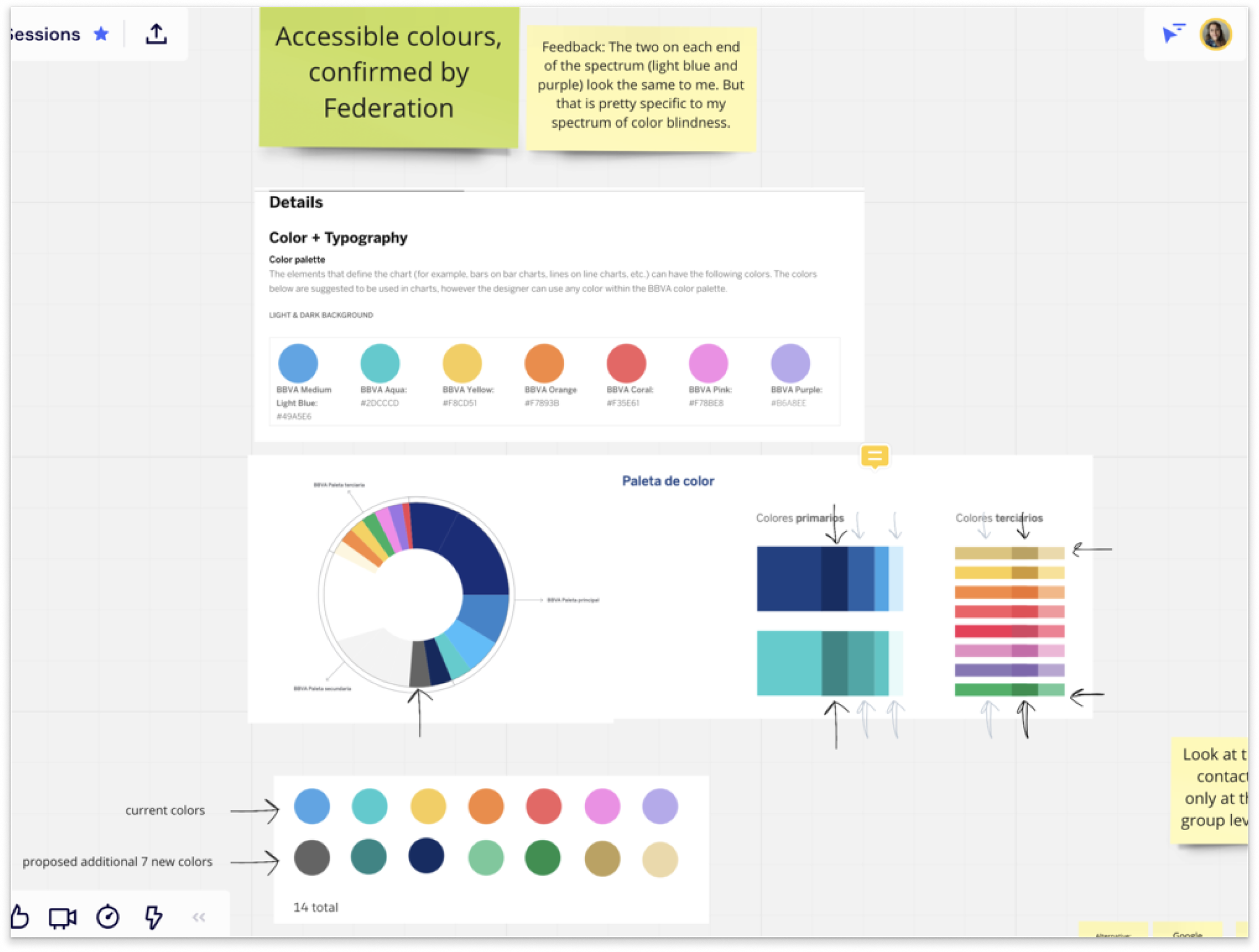
During workshops, users noted that some were color-blind. By testing colors on webaim.org, we confirmed that selected colors were distinguishable, ensuring accessible visuals.
TREE MAP
On day one, we hit the ground running with our first exercise in which we employed a tree map exercise. The image below is an example of the massive amount of data gathered, and this was only one of the dashboards!
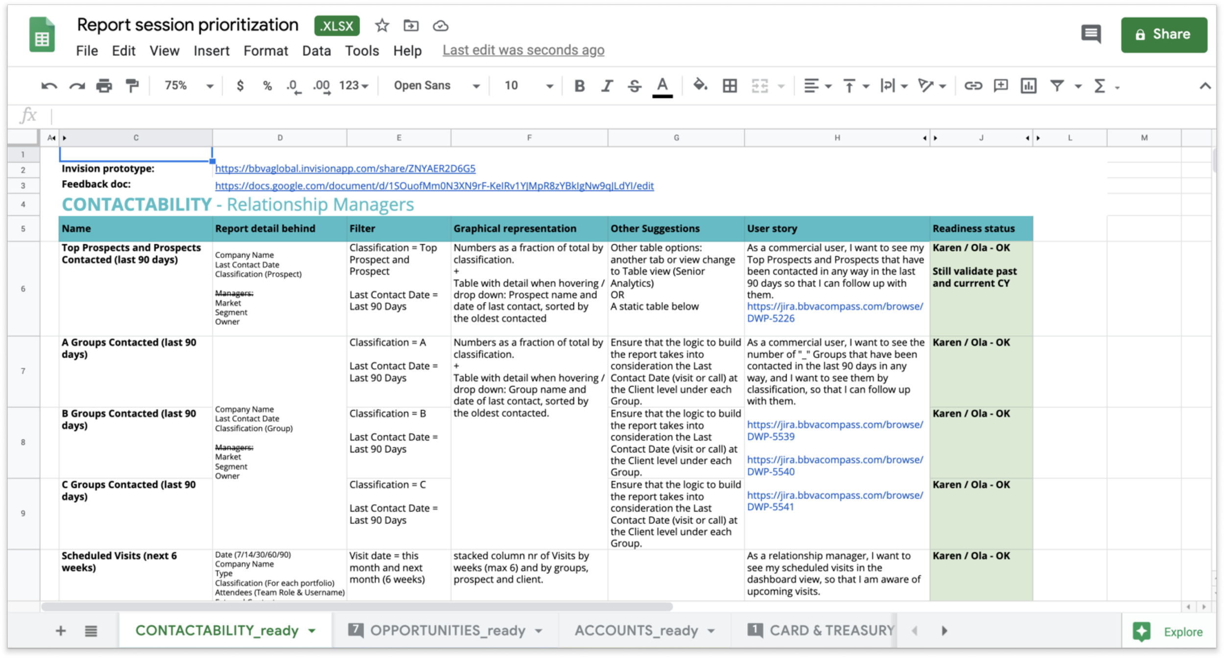
An example of the type of information gathered using the data tree map exercise, in this case, for the Contactability dashboard s!
During the week-long sessions, we gave them view-only access to the Miro board, as we didn’t to overwhelm them with new software. The voting exercise took place on Excel for this reason, so they could actually go into the document and vote. In the end, we executed the same exercises/process for 4 dashboards.
We continually built on the exercises done the day before. These co-creation sessions truly helped ease us in the definition stage of the design process.
A) Tree map exercise in Miro: Consisted of mapping out all the data points bankers needed and grouping them into sizeable chunks that made the most sense.
B) Voting exercise in Excel: After gathering data points, we moved the information to an Excel spreadsheet, where we set up a voting system to give each participant in our sessions a vote for what they each would like to see and in what order, and tally up the final results.
C) Prioritization exercise in Miro: We took the results from the voting exercise and went back to Miro to begin arranging things in their respective order. We placed the data into “tiles” so our users could start to visualize how the data would be organized.
Discussions at this point were centered around how the data would be visualized and in what order. We documented any insights as to how to best graphically represent the information (bar charts, pie charts, dot plots, etc).
Data visualization & DESIGN PROCESS
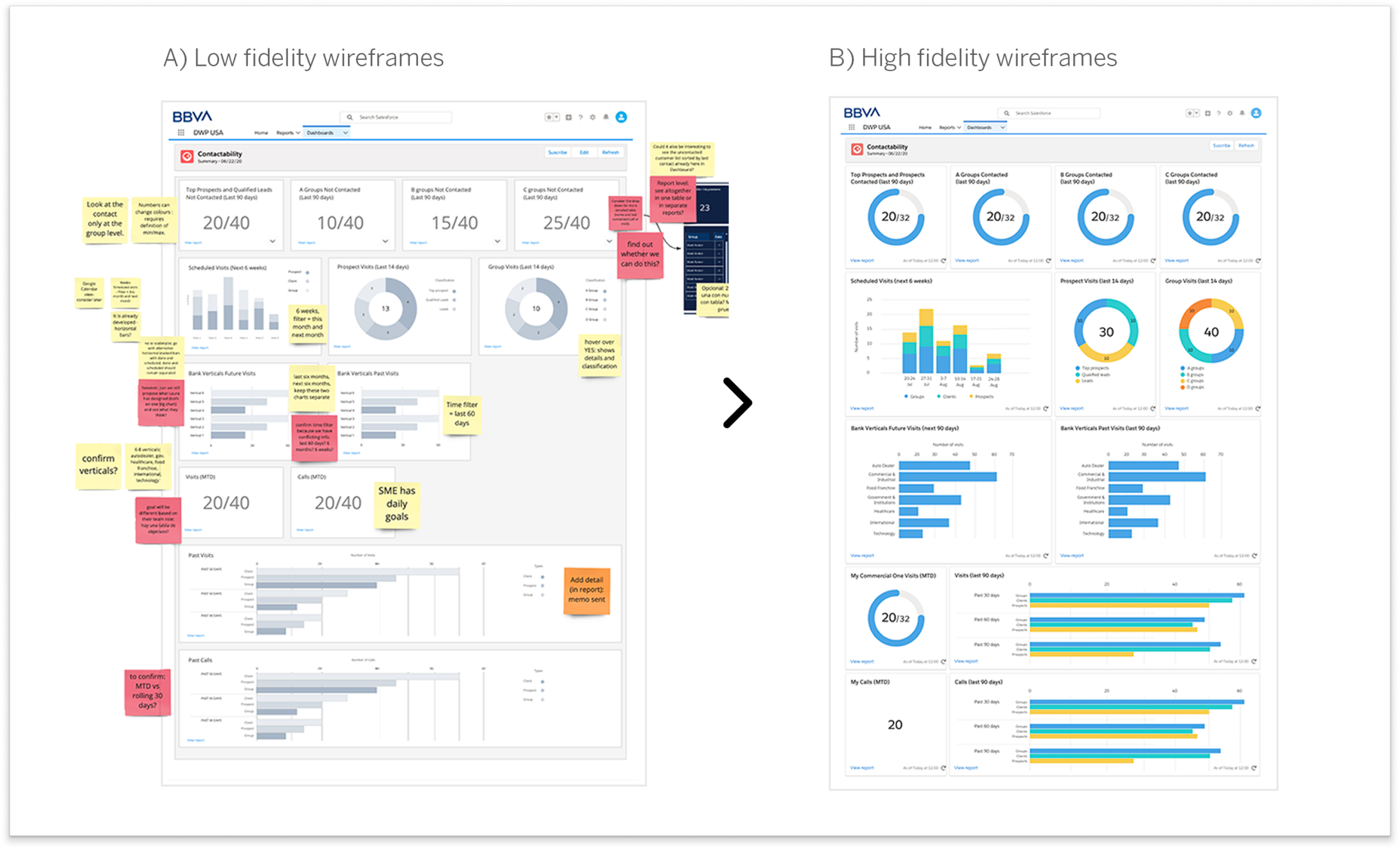
From user input, we created low-fidelity wireframes in Miro before transitioning to high-fidelity prototypes in Sketch. With Salesforce Lightning Design System components, I crafted user-friendly dashboards with clear data visualizations, tailored for actionable insights like recent call volumes over 30/60/90 days.
This chart aims to answer the question: How many calls have I completed in the last 30/60/90 days?
Once our rough mockups were looking more defined, I moved them into Sketch. With the high fidelity wireframes completed, I created simple prototypes for our developers to use.
Example of one of the charts moved into Sketch for a higher fidelity of design.
Remote collaboration & Getting Closer
Throughout the design process, we continued to have additional remote meetings with our champions. We often met to discuss the dashboard prototypes before finally moving into development work.
“I want access to Miro!”
“I feel like we’ve accomplished something over the last week.”
“A real conversation starter”
Constantly questioning the why!
As we continued the process of gathering notes, organizing, rearranging, asking questions, then testing our assumptions throughout the process, we started defining and designing, continuing to talk through assumptions and questions with our champions.
With the help of our champions, co-creation methods and online collaborative tools, our remote workshops were very productive and we were able to get a lot from the sessions. In the process of doing so, we also gained stakeholder trust and ended up having more access to our champions to continue the research work beyond our weeklong co-creation allotted schedule.
Implementation
Working with Spain-based developers and Alabama-based analysts, we coordinated through frequent remote meetings, Google Docs for feedback, and Excel for design QA. Documentation proved essential for tracking complex tasks across time zones and overcoming hurdles. Despite challenges with Salesforce’s out-of-the-box (OOTB) components and a pivot from custom to standardized solutions, we adapted our designs to align with practical constraints.
Documentation was essential as there was a lot of moving parts and people contributing to the project.
Demoing on Webex calls
Writing Jira tickets with the business analysts
Excel spreadsheets for Design QA
And Google Docs for documenting feedback
I was actively involved in the QA process as I had access to a dev sandbox environment in which I double checked any dev work being done! Good thing I have an eye for detail ;)
Unexpected hurdles
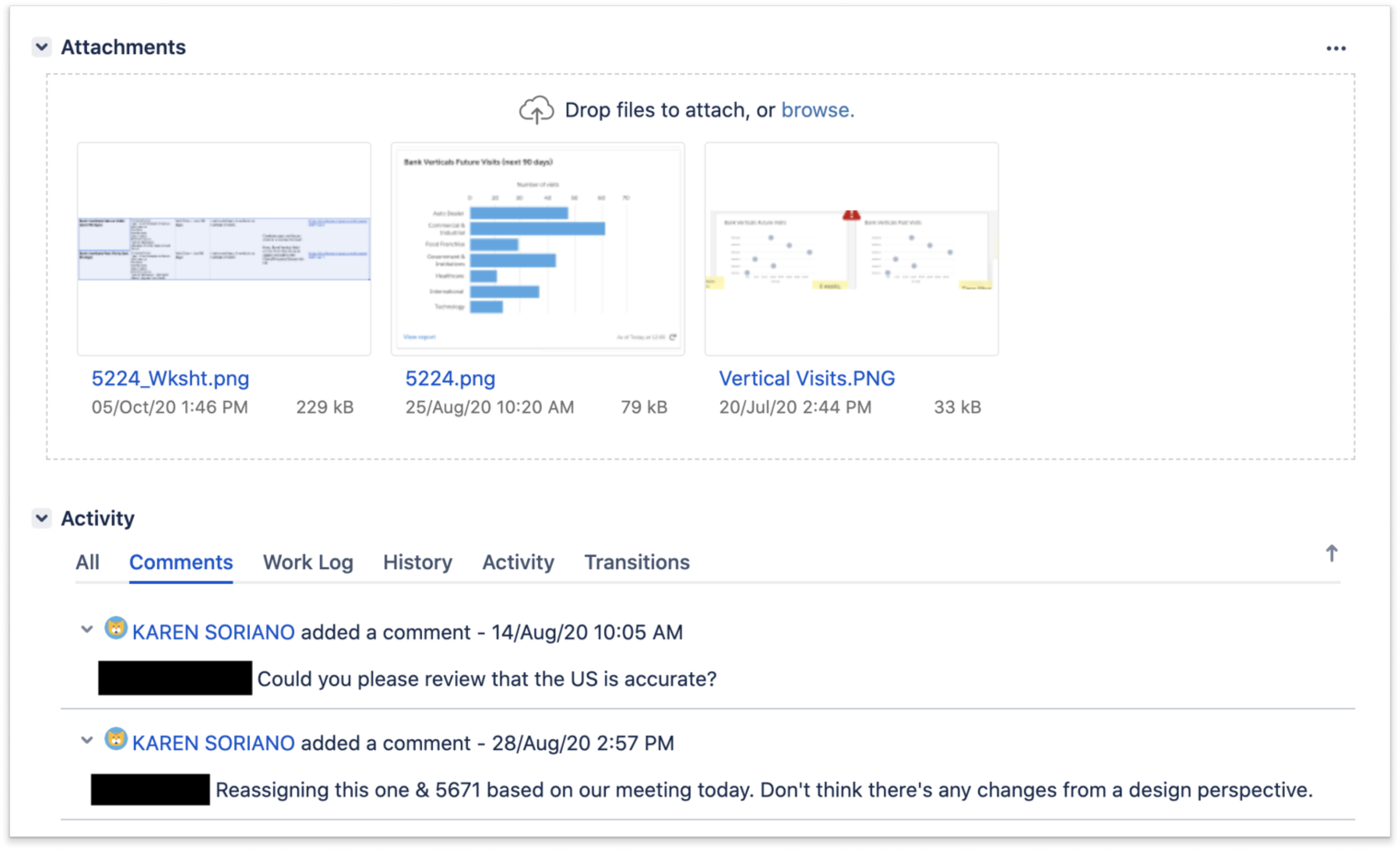
Late-stage adjustments required some features to be simplified or redesigned. For example, we altered our “Calls (last 90 days)” chart to fit Salesforce’s OOTB limitations, prioritizing clarity and usability within our resources.
Some of the graphs that we were hoping to implement had to be changed. In some cases, we went back to the drawing board as to how to visualize the data to make it easy for the users but also would fit our constraints in terms of resources, development and time.
Before: Calls (last 90 days) is just one of the charts that had to be simplified.
After: Calls (last 90 days) as the simplified version due to constraints.
Conclusion & potential impact
At this point, internally we were on the verge of continuing to improve the user experience and continue incorporating the sales process, and starting to movE away from relying on our global design and research team and centering the experience around the US context.
During our launch month, news broke that PNC had bought BBVA’s USA operations. At the time of the news, we were in the last steps of launching the first iteration of Reports and Dashboards and getting it in front of actual users. Unfortunately, DWP was decommissioned so no work was to be continued at this point.
Although the project didn’t fully launch due to BBVA’s acquisition by PNC, our work anticipated several key benefits:
Streamlined Banker Workflows: A unified platform was set to reduce time spent on system navigation.
Enhanced User Satisfaction: Tailored U.S.-based features aimed to boost banker efficiency and satisfaction.
Scalability: This U.S. adaptation served as a potential blueprint for future global markets.
Dashboard level (prototypes)
Dashboard level (Salesforce)


Reflection
This project was a learning experience in adapting global tools to local contexts and how co-creation methodologies can foster more effective solutions in complex systems. Leveraging subject matter experts to inform and shape the product was a key takeaway, underscoring the importance of inclusive collaboration in crafting impactful designs.
Looking back, I recognize an opportunity to have strengthened my foundational knowledge in banking and Salesforce early in the process, which would have enhanced my ability to contribute strategically from the start. Despite this, the project deepened my expertise in cross-cultural collaboration, adaptability, and stakeholder engagement—skills I continue to draw on in managing and designing for large-scale design projects.


